Big Planet Ventures is an early stage investor firm, focusing on disruptive ventures that are at the forefront of our efforts in gaining collective environmental consciousness. From cell-cultured pork meat to implemented AI or on-demand pop-up food services, their portfolio covers a wide array of projects working for a greener future.
They were looking for an extensive revamp of their design language to better communicate their values: simplicity, a planet-oriented thinking and expertise that can be trusted, all while maintaining an approachable tone.
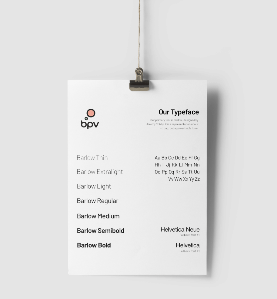
Page from Big Planet Brand Guide
As a stylised representation of a planet, I focused on circular elements; this also lends a simple and approachable feel to the design. To balance this, I introduced bold and contrasting elements, such as heavy strokes and typography. Through an iterative process, I established an overall direction for the branding: A custom-made circular typeface and planetary elements for the logo, paired with fresh sans serif font for text.
The colour palette was constructed with a lush, healthy planet in mind, using muted pastel colours for an easier contrast to the heavy visual elements. We also decided upon a strictly typographic approach, intentionally avoiding photography to make words used in text even more dominant—to sound approachable and friendly for businesses big or small, but maintaining the strength of an investment firm that can be trusted.

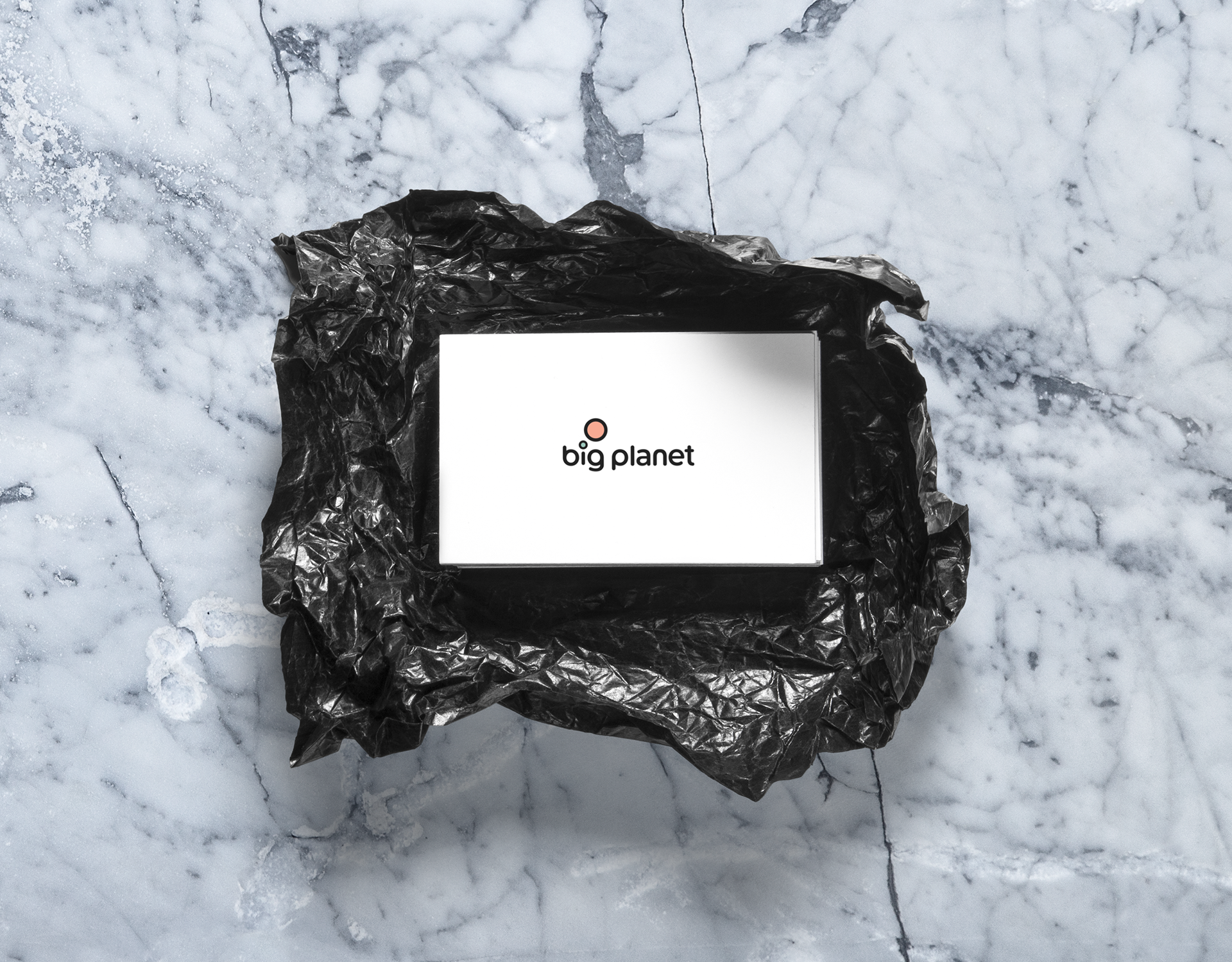
The logo was designed to be responsive, with different size-variations. The mark represents a planet-group, as well as symbolising the ideas that matter, with a thought bubble-like composition. Using green (for growth, nature) and salmon (for fellowship, support) the mark is an easily recognisable element of the brand.
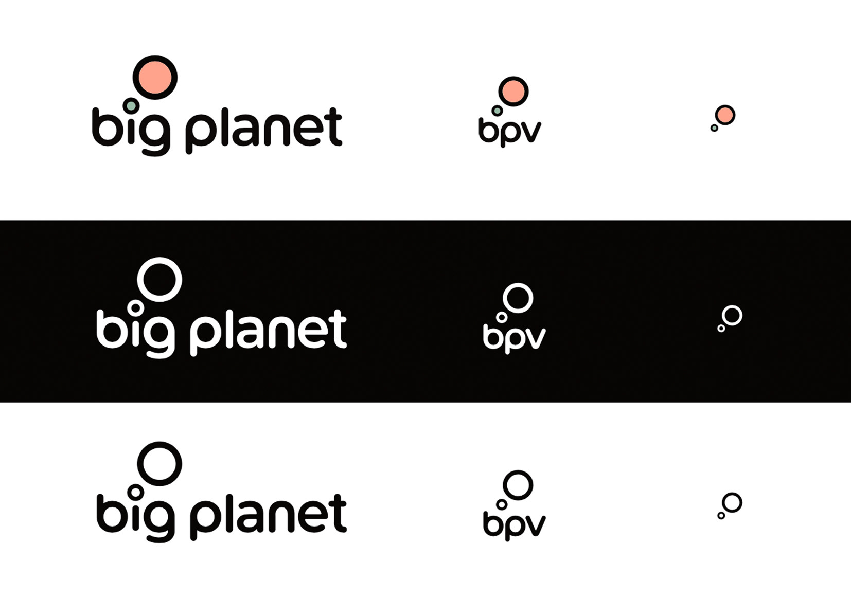
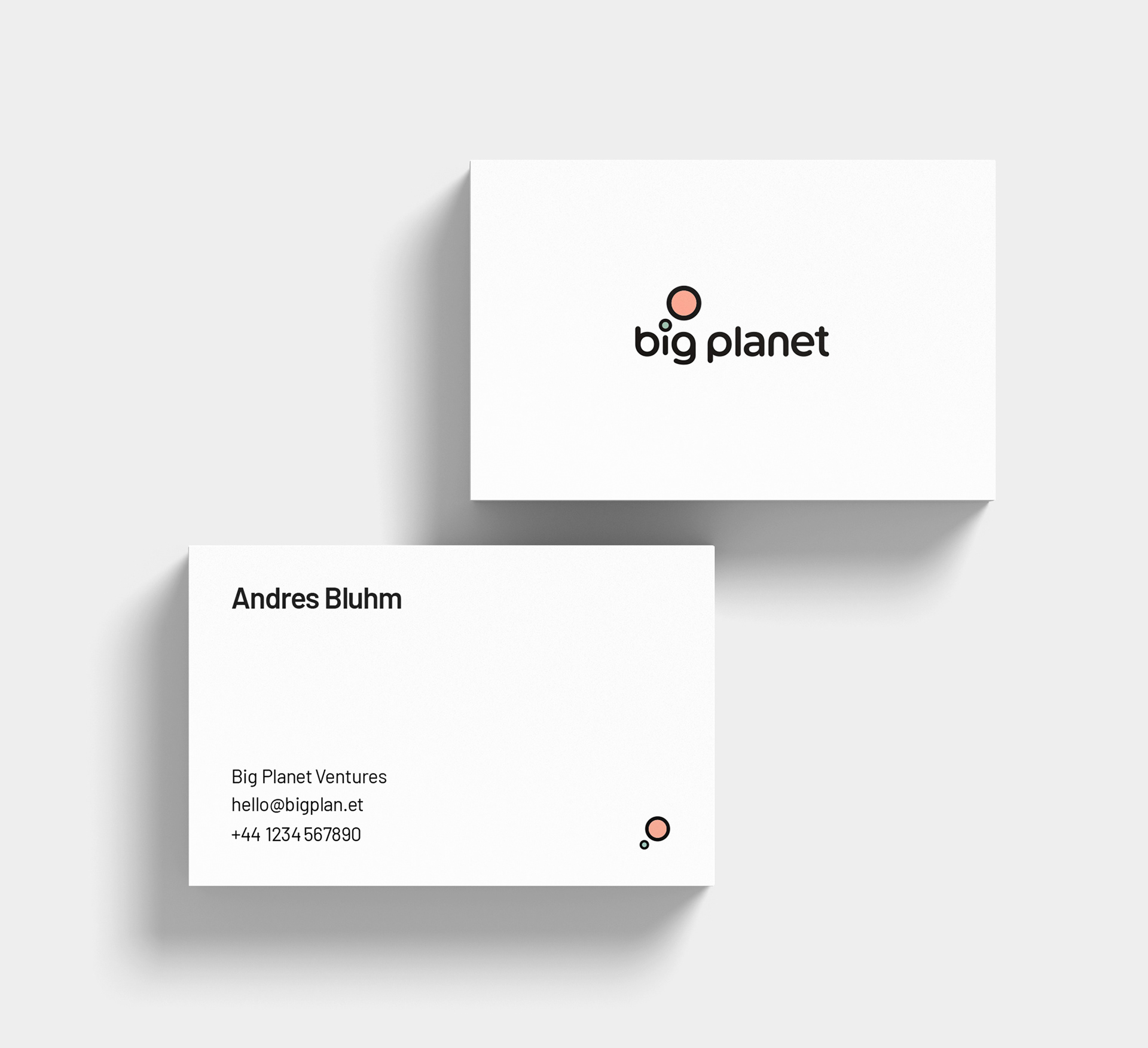
Three size variations in normal, negative and b&w versions
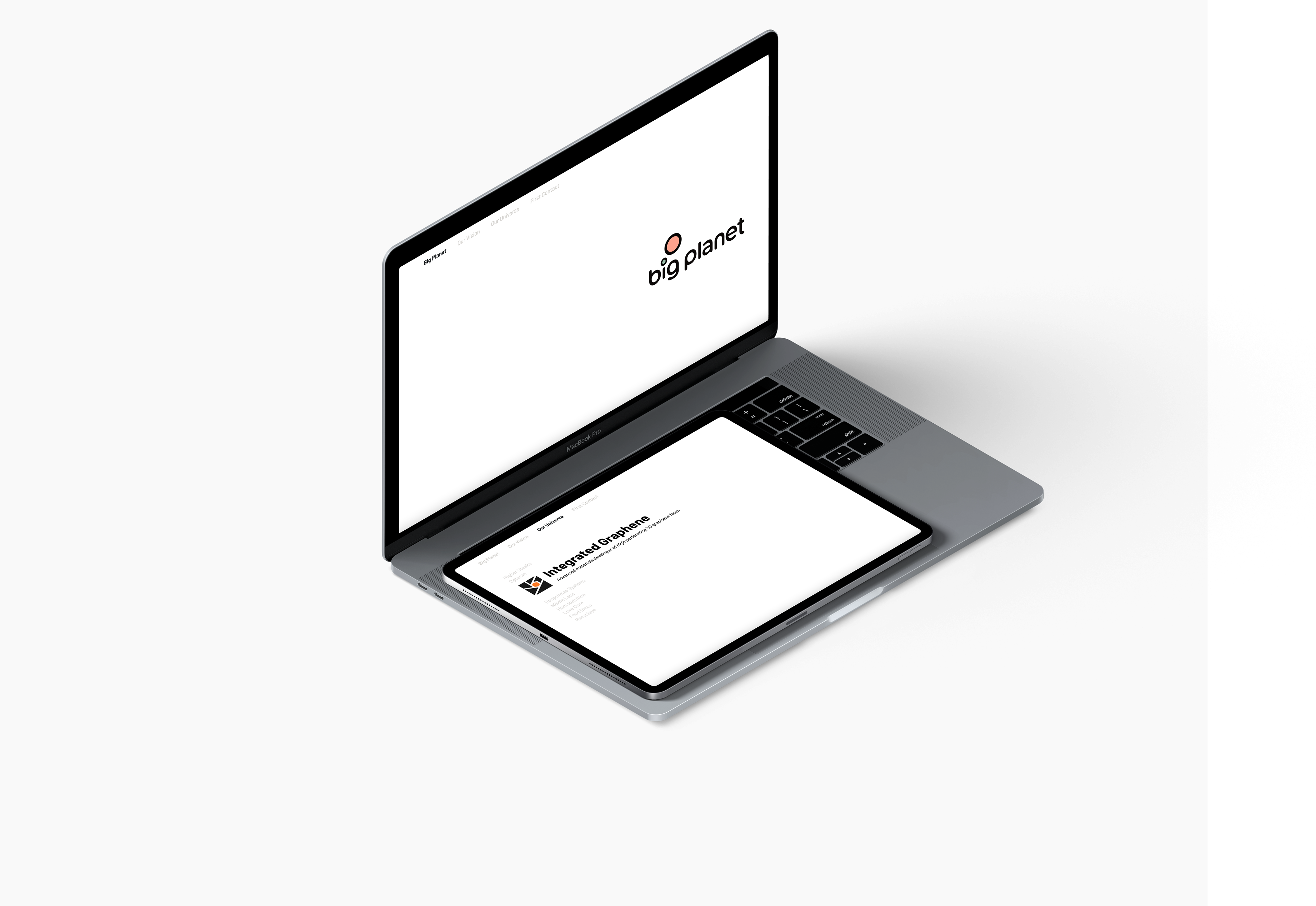
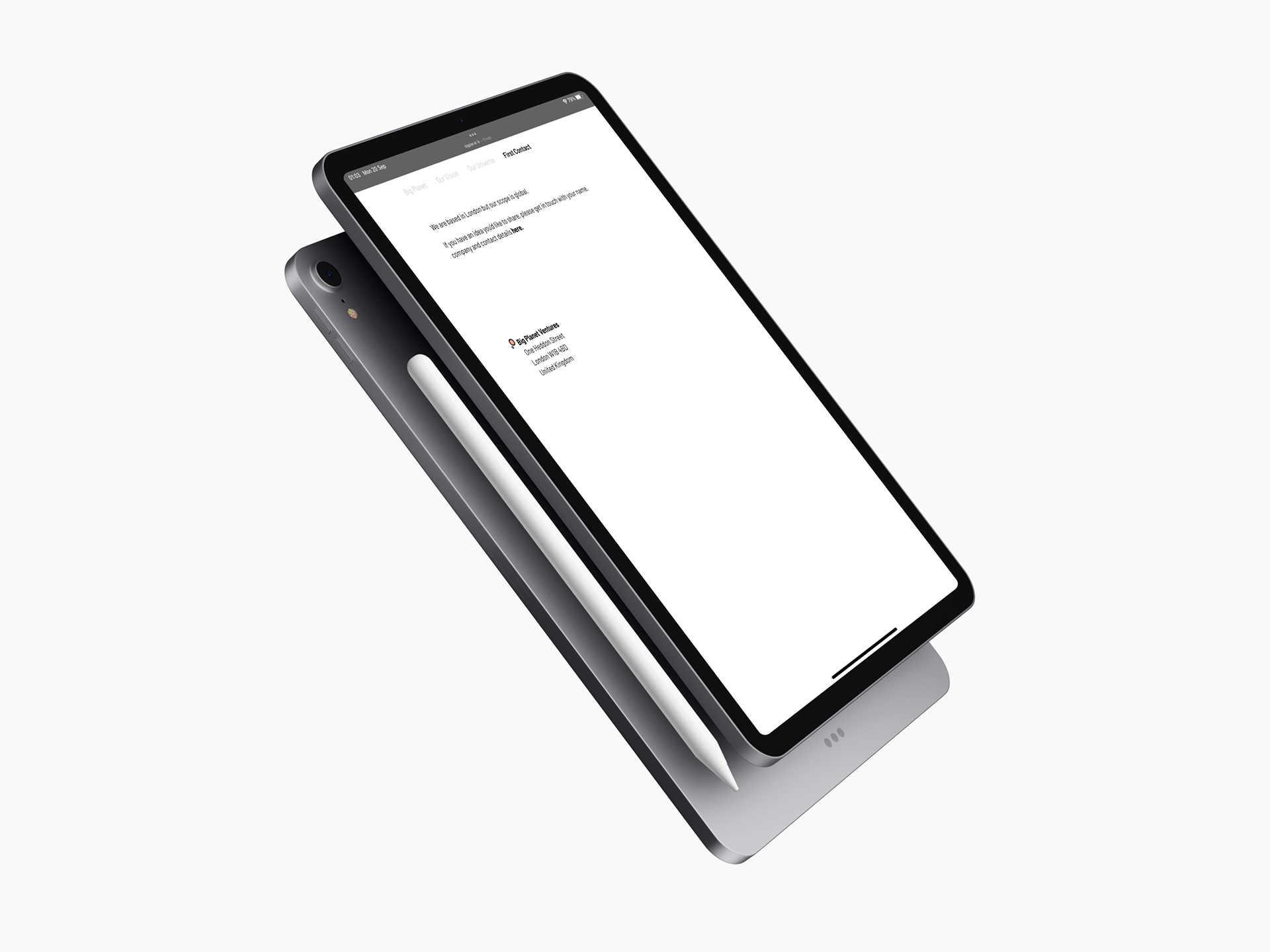
Building upon this visual language, their website was designed and built from the ground up to be extremely minimal, focused on typography with a strong composition.