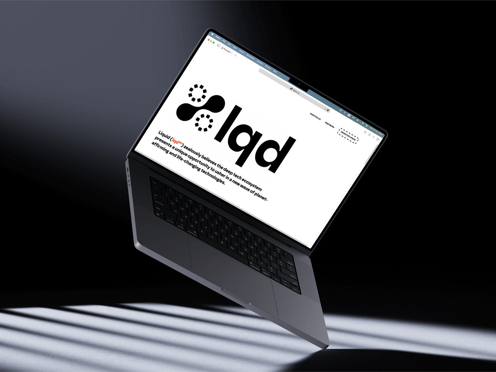

Liquid Ventures (lqd vc) is an early stage investor firm, focusing on deep tech opportunities. From quantum-computing systems to unmanned aerial vehicles, their portfolio aims to usher in a new wave of planet-affirming and life-changing technologies.
They were looking to establish their brand, built from the ground up to communicate their unique approach to investing in tech. This is represented by an underlying matrix: A vertical deep tech investment, and a horizontal cell-based fund.
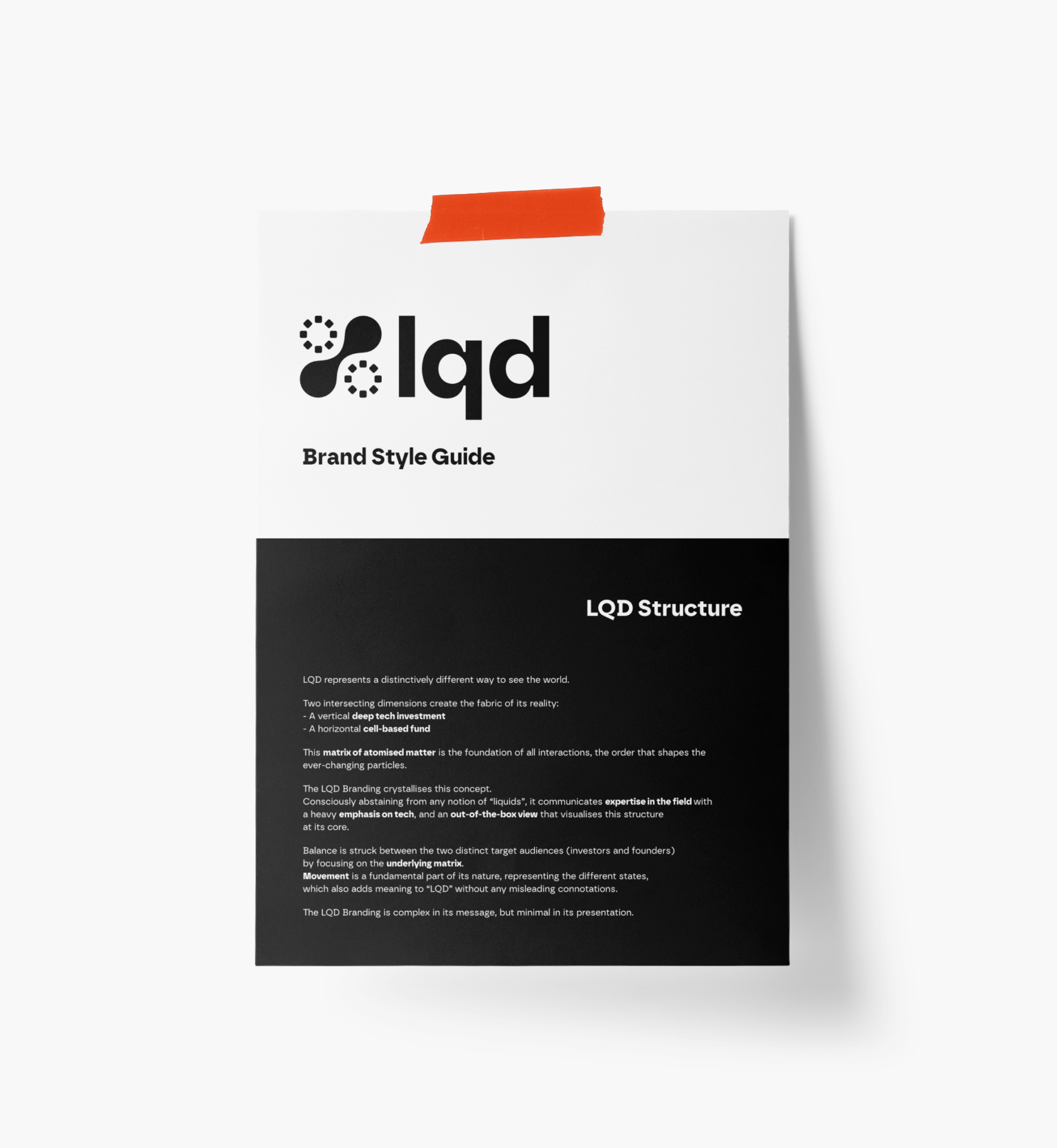
Page from Liquid Ventures Brand Guide
The brand communicates expertise in the field with a heavy emphasis on tech, and an out-of-the-box view that visualises this structure at its core.
Movement is a fundamental part of its nature, representing the different states, which also adds additional meaning to 'lqd'.
The LQD Branding is complex in its message, but minimal in presentation. Balance is struck between the two distinct target audiences (investors and founders) by focusing on the underlying matrix.

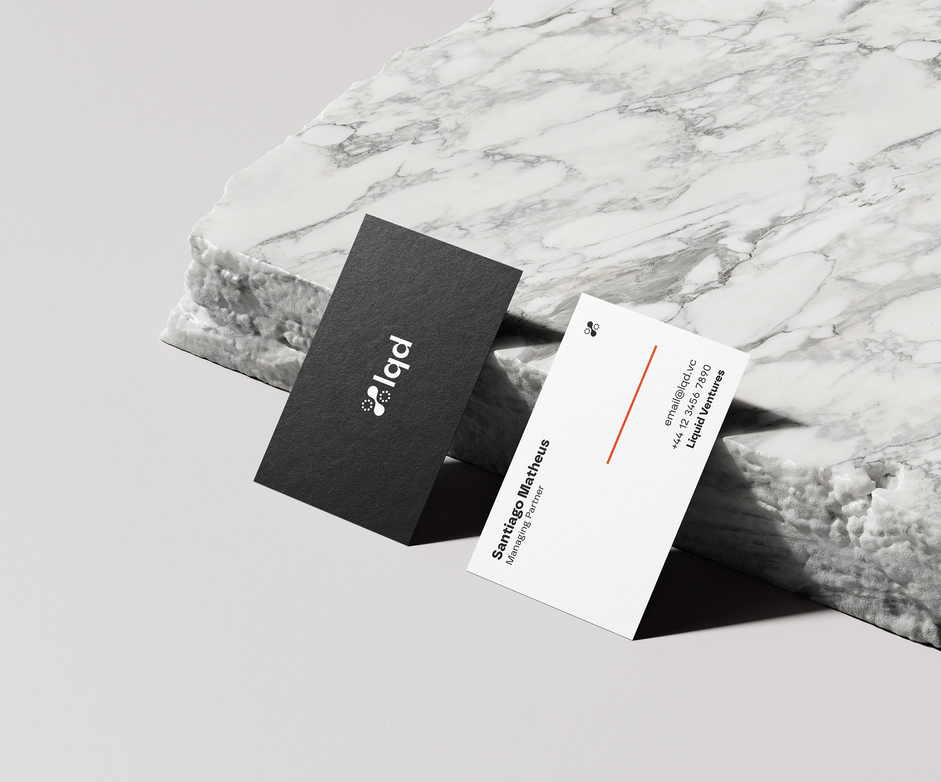
The colour palette is dominated by black and white, paired with a rich orange to evoke confidence and expertise, while contrasting colours that often dominate financial brands. It is also used to fully disassociate from any forms of liquid water.

Visualising the underlying cellular matrix that defines LQD, the logo mark is made of four cells, hinting at the smaller view of a greater system. Two cells are connected in a fluid, dynamic way to indicate a progressive and upward trend. This mark is paired with a clean sans-serif typeface with prominent ink traps to signal the technology-facing approach, while maintaining a professional feel.
The logo was designed to be responsive, covering variations from the smallest logo mark to the full 'liquid' word. A fourth version can be used in special cases when the full name is imperative.
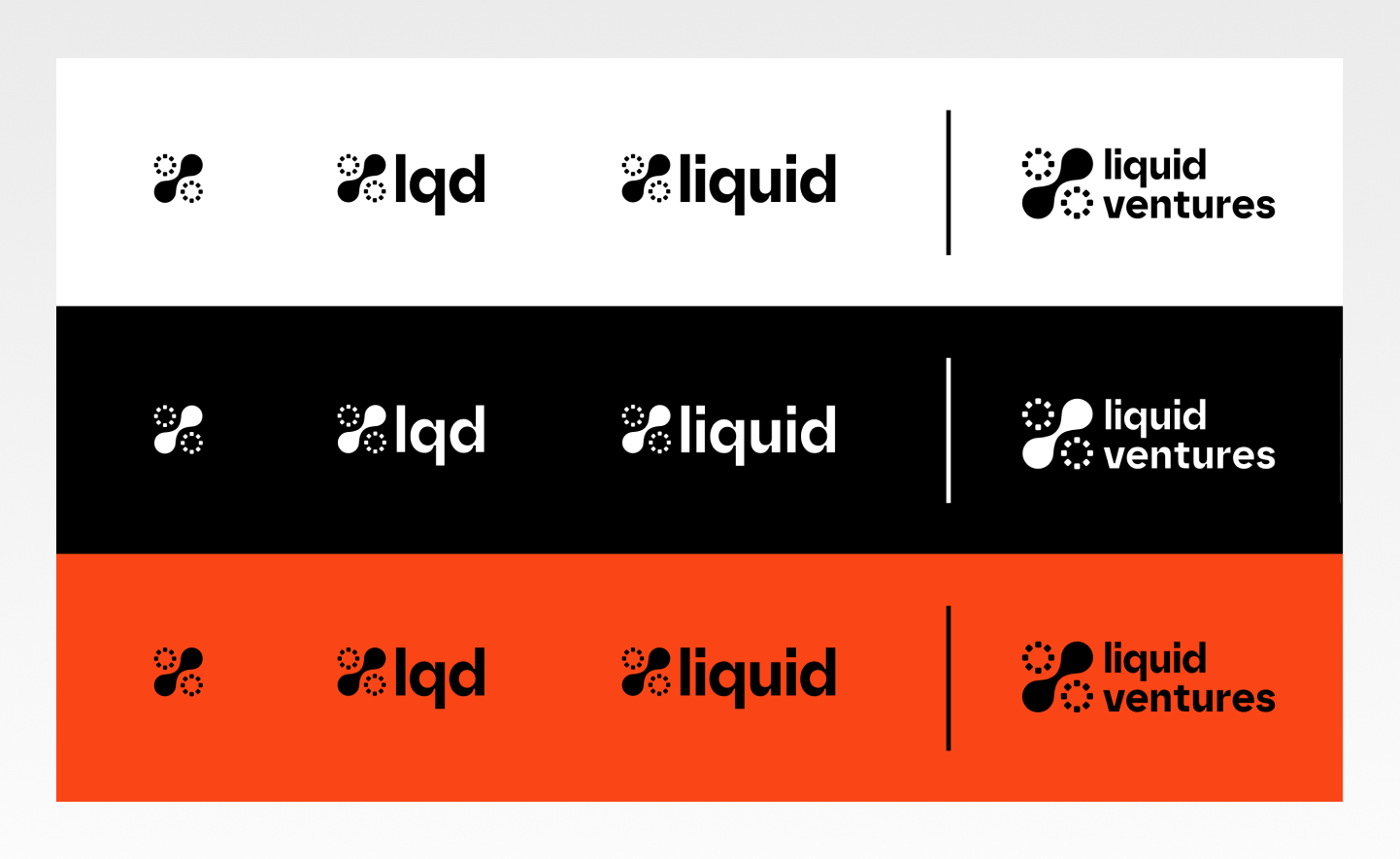
Size variations ranging from logo mark to full company name, in both normal and negative versions.
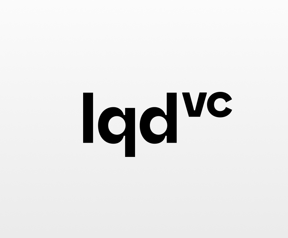
A flavour-variation is also added to be used in cases where text-only solution may be the most ideal approach. This variation simply adds superscript formatting to 'vc'. This is a visual formatting that is familiar to both scientific (founders) and financial audiences (investors), encapsulating LQD’s core message — raising 'lqd' to the power of 'vc'.
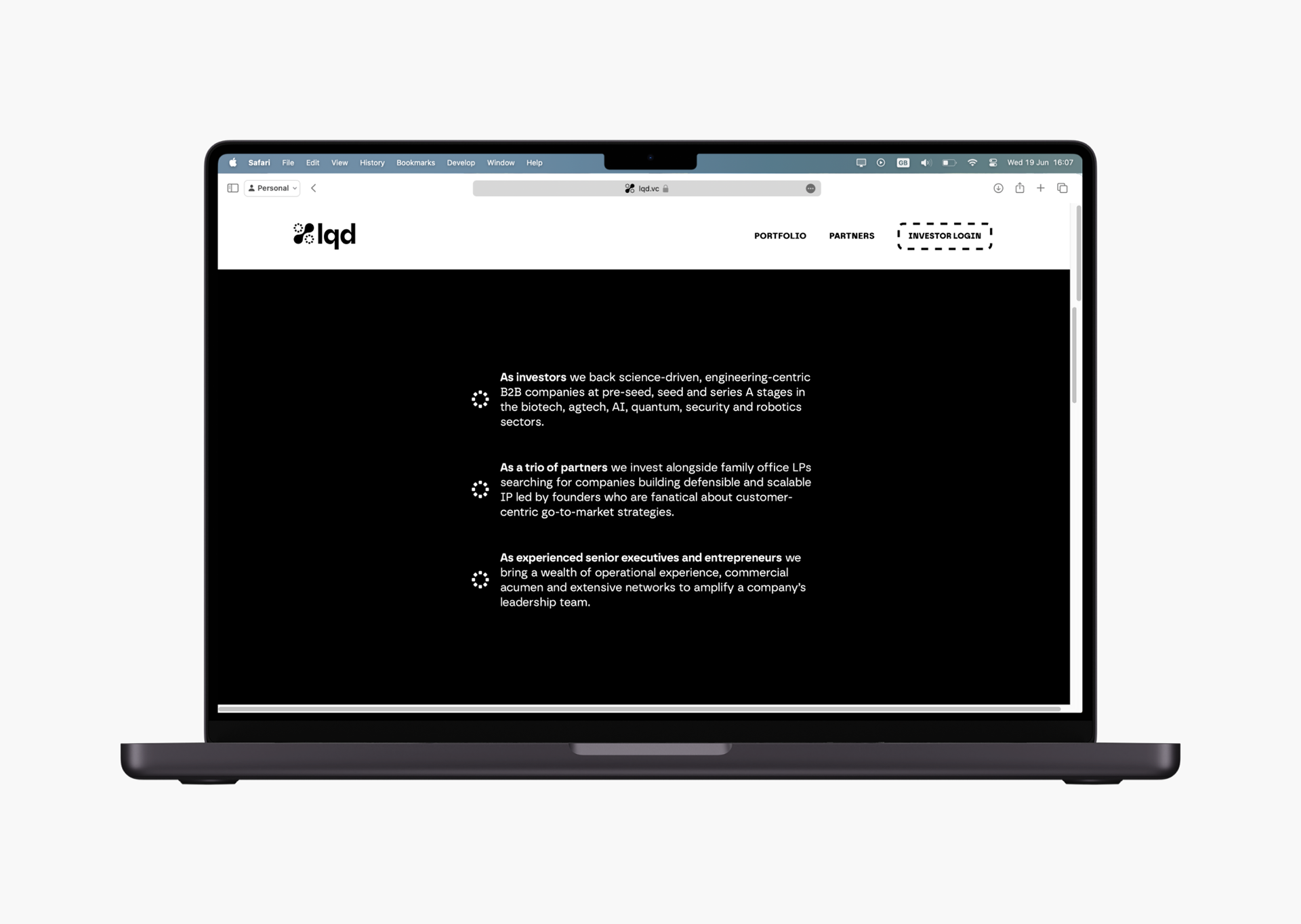
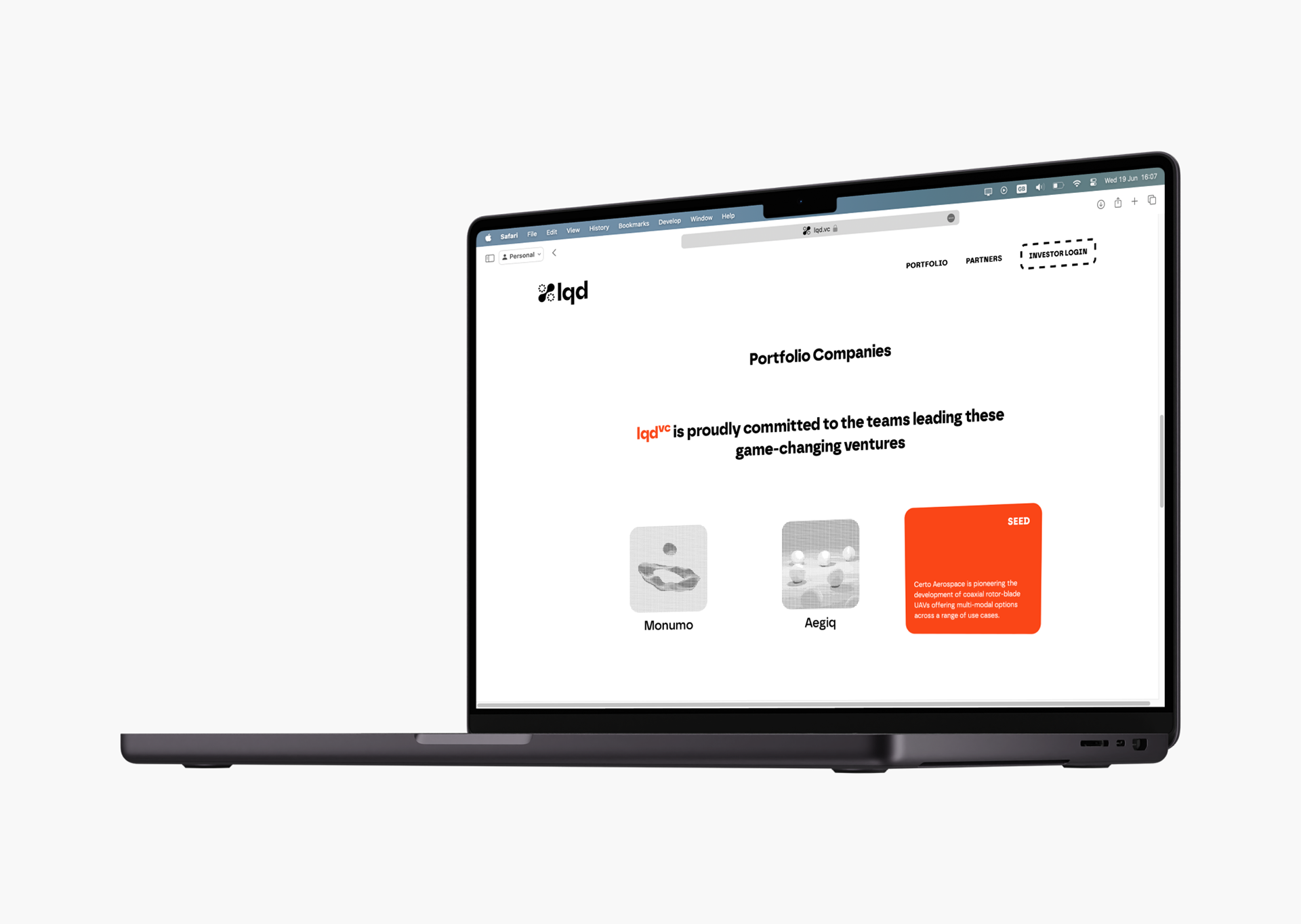
Building upon this visual language, their website was designed and built from the ground up to be extremely minimal, focused on typography with a strong composition.
Internal documents and presentations were also produced with fundraising and marketing purposes.